The YouTube redesigned player is here and it is changing how we watch, engage, and enjoy videos. In one of its most significant interface updates in recent years, YouTube has unveiled a cleaner, smarter, and more interactive player designed to enhance the overall viewing experience across mobile, web, and TV platforms.
This new design aims to simplify how users interact with videos, making controls less intrusive and navigation more intuitive. But it is not just about aesthetics. The redesigned player also introduces interactive features, smoother gestures, and subtle visual enhancements that create a more immersive and enjoyable experience for everyone.
Let’s take a closer look at what’s new, why it matters, and how the YouTube redesigned player could shape the future of digital video consumption.

A Fresh Look: Simpler, Smarter, and More Immersive
YouTube’s updated player focuses on a minimalist design philosophy. The goal is to help viewers concentrate on the video rather than the interface.
Cleaner Design and Layout
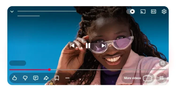
The new interface features rounded, translucent icons that blend seamlessly into the video background. This approach reduces visual clutter and ensures that playback controls don’t distract from the content.

On mobile devices, the control buttons have been repositioned to be more accessible, while the full screen and volume controls have a sleeker appearance. The design feels consistent whether you are watching on your phone, tablet, desktop, or smart TV.
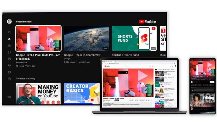
On larger screens like TVs, YouTube has repositioned key controls such as play and pause, while information such as video titles and channel names now appear in cleaner sections. The goal is a layout that looks elegant yet familiar, one that emphasizes usability without overwhelming the viewer.
Consistency Across Devices
One of the main improvements with the YouTube redesigned player is consistency. In the past, YouTube’s appearance could vary depending on whether you were watching on Android, iOS, or a smart TV. The new update brings all platforms into alignment, ensuring the same visual identity and user flow across devices.
This unified design not only improves accessibility but also enhances the platform’s brand experience. Whether you switch from your phone to your TV, you’ll notice the same intuitive layout and control scheme.
Smoother Animations and Transitions
YouTube has also added subtle animations and transitions to make interactions feel more natural. For example, tapping or double tapping the screen results in smoother motion cues, while the transitions between video modes such as portrait to landscape or full screen are faster and more fluid.
The overall experience feels more polished. Every button press, swipe, and tap now flows naturally into the next, creating an environment that feels more refined and less mechanical.
New Interactive Features: A Step Toward Smarter Engagement
The most exciting part of the YouTube redesigned player is its new set of interactive features. These are not just cosmetic upgrades. They fundamentally change how users connect with content and creators.
Upgraded Double Tap Gesture
The familiar double tap feature, which lets users skip forward or backward by ten seconds, now looks and feels smoother. The animation that appears when you double tap is more modern, minimal, and less distracting. It helps you navigate through the video quickly without interrupting your viewing experience.
Enhanced Like Animations
YouTube has added a playful touch to engagement. When you like a video, you might notice small themed animations that appear on screen. These animations change depending on the type of video. For example, liking a music video might show musical notes, while a sports clip might trigger an energetic visual cue.
This may seem like a small addition, but it adds a sense of joy and personality to interactions. It transforms a simple like into a more expressive action, something that aligns perfectly with YouTube’s goal of making engagement feel fun and rewarding.
Improved Comment Threads
Comments have also been restructured for clarity. The redesigned comment section introduces threaded replies, allowing for better conversations between viewers. Instead of getting lost in long lists of replies, users can now follow discussions more easily.
Creators benefit from this feature as well, since it helps build stronger communities around their channels. Discussions can now be more organized, friendly, and interactive, something that enhances both engagement and moderation.
Simplified Saving and Playlist Management
Saving videos to Watch Later or adding them to a playlist is now smoother and more visual. The updated interface makes the process faster and clearer, reducing the number of taps needed. For heavy YouTube users who love curating playlists or saving tutorials, this is a small but impactful improvement.
Why the Redesign Matters
The YouTube redesigned player is not just about visual appeal. It is about improving the entire user experience. Here’s why this change is important.
Focus on Content, Not Controls
By minimizing the size and visibility of playback buttons, YouTube ensures that the video remains the central focus. This helps users stay immersed in what they are watching rather than being distracted by interface elements.
Better Engagement Through Interaction
Interactive animations and threaded comments make engagement feel natural and enjoyable. Viewers are encouraged to interact more frequently, while creators benefit from deeper audience involvement.
Smoother Navigation for a Faster World
Today’s digital users expect instant responsiveness. The new gestures, smoother transitions, and simplified navigation reduce friction, making it easier to control playback without breaking the flow of the experience.
A Unified Ecosystem
The consistent look across all devices strengthens YouTube’s brand and makes switching between screens effortless. Whether you are watching a vlog on your phone or a film on your TV, the experience feels unified and familiar.
A Platform Built for the Future
With this redesign, YouTube is preparing for the next generation of interactivity, possibly integrating even more features like AI-based recommendations, live engagement tools, and personalized overlays. The current changes lay the foundation for those future innovations.
What It Means for Viewers
For everyday viewers, the YouTube redesigned player makes the experience more enjoyable and efficient.
Less clutter. The translucent design ensures fewer distractions on screen.
Better gestures. Double tap and swipe gestures are now smoother, more accurate, and faster.
Fun engagement. Like animations add a playful element to interacting with content.
Improved readability. Threaded comments and new text formatting make conversations easier to follow.
Personalized feel. Every interaction feels more fluid and human, not just mechanical.
In short, the redesign doesn’t just look better, it feels better to use.

What It Means for Creators
For content creators, YouTube’s redesign offers new opportunities to connect with audiences and grow their channels.
Longer watch times. The cleaner interface encourages viewers to stay focused on videos.
More engagement. The new animations and comment threads can increase likes, shares, and replies.
Improved community building. Organized comment threads help creators maintain active and respectful communities.
Visual consistency. Creators can now design their thumbnails, video intros, and outros knowing the interface won’t obscure key elements.
Stronger retention. A better experience means more repeat viewers and loyal subscribers.
Creators who adapt to the new system by experimenting with playlists, encouraging comments, and using visual cues will likely see stronger engagement metrics over time.
What It Means for Advertisers
Advertisers are also likely to benefit from the YouTube redesigned player.
Higher ad engagement. A more immersive experience means users are more likely to stay on videos, increasing ad viewability.
Cleaner presentation. Ads now appear in a less intrusive environment, blending naturally into the experience.
Improved analytics. As interaction patterns evolve, YouTube’s data insights may become more detailed, helping advertisers target audiences more effectively.
More brand friendly layout. With fewer distractions, sponsored content and in video placements become more noticeable.
In the long term, this cleaner, more engaging environment could strengthen YouTube’s position as the most effective video advertising platform in the world.
Tips to Make the Most of the Redesigned Player
Whether you are a viewer, creator, or marketer, here are some ways to make the most of YouTube’s new design.
For Viewers
Explore all gestures. Try out the updated double tap, swipe up for details, and new save options.
Use the Watch Later feature. The improved interface makes it easy to organize your watchlist.
Engage with creators. Comment using the new thread system to be part of meaningful conversations.
For Creators
Adapt to the new design. Check how your videos look with the new layout and ensure key visuals aren’t hidden.
Encourage engagement. Ask viewers to like, comment, and share; the new animations make these interactions more rewarding.
Build stronger discussions. Take advantage of threaded comments to interact directly with fans.
For Advertisers
Test ad placement. Experiment with ad formats to see how they perform with the updated player.
Leverage user engagement. The cleaner layout means your message stands out more; make your ads visually appealing.
Monitor analytics. Keep an eye on how user behavior changes with the redesign and adjust campaigns accordingly.

Potential Challenges and User Reactions
While the update has been praised for its simplicity, not everyone welcomes change right away. Some users have reported needing time to adjust to the new layout or gesture placements.
Others have expressed mixed feelings about the repositioned buttons and new animations, preferring the older interface for familiarity. However, such reactions are common after major redesigns, and over time most users adapt once they experience the benefits firsthand.
As YouTube continues refining its player, it is likely that small tweaks will follow based on user feedback. The company has already hinted that this redesign is part of an ongoing effort to evolve the platform, meaning even more improvements are on the horizon.
The Future of YouTube’s Viewing Experience
The YouTube redesigned player marks the start of a larger shift. With more viewers consuming content on mobile and TV screens, YouTube is positioning itself for the future of digital media, one that is more interactive, immersive, and user centric.
We can expect to see further integration of artificial intelligence to personalize recommendations, adaptive playback settings that adjust based on user preferences, and possibly more ways for creators to interact with their audiences in real time.
This update is not just about cosmetic design. It is about shaping how the next generation interacts with video.
Final Thoughts
The YouTube redesigned player is a thoughtful, forward looking upgrade that redefines how we experience online video. By simplifying design, improving navigation, and adding interactive touches, YouTube has made watching videos feel more fluid, enjoyable, and engaging.
For viewers, it offers a smoother and more satisfying experience.
For creators, it opens new possibilities for storytelling and community building.
For advertisers, it strengthens YouTube’s position as a top tier platform for engagement and reach.
In essence, this redesign is more than a visual refresh. It is a promise of what’s to come. YouTube is paving the way for a future where watching, interacting, and connecting through video feels effortless, personal, and exciting.
So, whether you are watching your favorite music video, learning from a tutorial, or following a live stream, one thing is certain. The YouTube redesigned player makes the entire experience better than ever.
Do follow UAE Stories on Instagram
Read Next – Global Blockchain Show 2025 Abu Dhabi: Web3 Innovation Unveiled


