The new Pepsi logo is more than just a fresh coat of paint. It is a bold redesign that reimagines one of the world’s most iconic brands for the modern age. Unveiled as part of Pepsi’s global brand overhaul, the new logo strikes a balance between nostalgia and innovation, appealing to a new generation of consumers while honoring its long-standing history.
In this article, we explore what is new in the design, the reasons behind the change, how it compares to past versions, public reception, and what it means for Pepsi’s future.
A Quick Look at Pepsi’s Logo History
Before we dive into the new Pepsi logo, it is worth revisiting the brand’s visual evolution. Pepsi, originally created in 1893 as Brads Drink, adopted the name Pepsi Cola in 1898. Over the decades, its logo has changed multiple times, each update reflecting the design trends and cultural shifts of its era.

Here are some of the major milestones
1898 to 1940s
Ornate swirling script similar to Coca Cola’s classic design

1950s
Introduction of the bottle cap icon and the red white blue color scheme
1962
The script was dropped in favor of bold sans serif fonts
1990s
Pepsi embraced 3D elements and gradients
2008
A minimalist approach was introduced with a smiling globe symbol
Each version aimed to capture the spirit of its time, but many fans felt that recent updates had become too minimal and lacked the energy of earlier designs.
What’s New in the 2024 Pepsi Logo
So what exactly has changed in the new Pepsi logo
Here are the major design updates
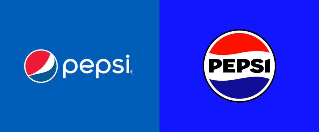
1. The Globe Returns Bolder Than Ever
The circular Pepsi globe is back front and center, but now it features a high contrast layout that brings red white and blue together with greater intensity. The globe is also perfectly centered with the wordmark for better alignment and symmetry.
2. Stronger Wordmark
The word Pepsi is now rendered in bold black all caps font, unlike the previous thin lowercase blue text. This new wordmark adds presence and makes the logo more readable across various media platforms.
3. Color Palette Refresh
While the red white and blue scheme remains, the colors have been deepened and saturated for higher impact especially on digital screens. The black wordmark is a new addition which contrasts sharply and adds sophistication.
4. Flat Yet Dynamic
While many brands are embracing minimalism, Pepsi has found a sweet spot creating a flat design that does not feel lifeless. The logo feels dynamic with color and balance evoking movement.
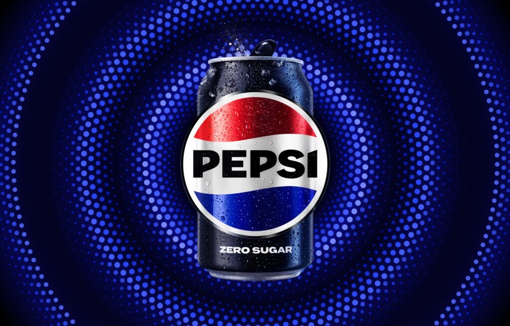
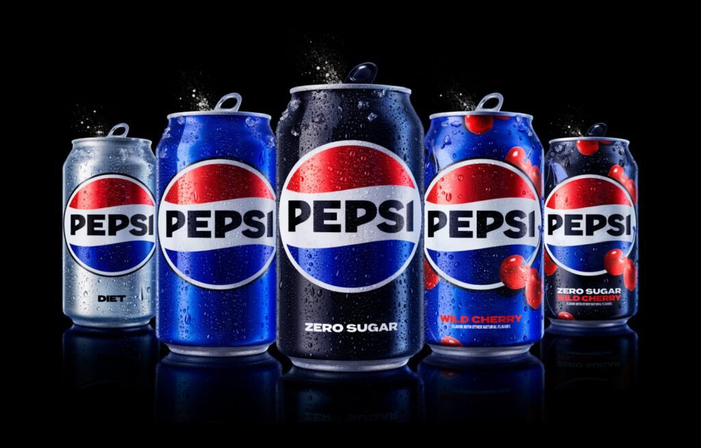
5. Consistency Across Packaging and Screens
Pepsi aims to unify its visual identity across digital physical and retail environments. The new logo is designed to look equally great on a smartphone screen soda can or billboard.
Why Did Pepsi Change Its Logo
According to PepsiCo, the rebrand is part of a strategic vision for the next decade. The company wants to better connect with Gen Z while staying rooted in its rich legacy.
Here are the key reasons behind the redesign
Digital Optimization
The old logo was hard to see or recognize at small digital sizes. The new one is bolder and more legible.
Nostalgia Meets Modernity
There has been a trend in branding toward retrofuturism taking the best from the past and updating it for today. Pepsi embraces this fully.
Stronger Shelf Presence
In a crowded beverage aisle a strong high contrast design can make all the difference. Pepsi wants to stand out.
Energy and Movement
The new globe and typeface create a sense of vitality matching the brands energetic marketing campaigns and positioning.
Public and Expert Reactions
When the new Pepsi logo was revealed reactions poured in from all corners of the internet.
Positive Feedback
Brand experts praised the return of the symmetrical layout and bolder color contrasts
Fans appreciated the nostalgic nod to the 1990s version calling it a return to form
Designers liked the modern flat look which balances minimalism with strong personality
Criticisms
Some critics argue that the black text feels too stark or corporate
Others feel that Pepsi is trying too hard to mimic previous successful designs rather than innovate
Despite mixed opinions the overall sentiment has been largely positive especially among younger audiences who see the change as fresh and exciting.
How It Appears on Packaging and Advertising
The new Pepsi logo is not just a digital rebrand. It is showing up across multiple touchpoints
Can and bottle packaging with redesigned labels and cleaner layouts
Vending machines and coolers with bold vibrant branding
TV commercials and online ads featuring the new logo in animated transitions
Social media platforms with cohesive branding from profile pictures to story templates
Even Pepsis delivery trucks uniforms and in store displays are being updated creating a consistent brand experience across every customer touchpoint.
Pepsi vs Coca Cola The Logo Wars Continue
Every time Pepsi makes a branding move comparisons with Coca Cola are inevitable. While Coke has kept a consistent classic script for decades Pepsi has frequently evolved its identity. Some argue that this shows agility while others see it as a lack of brand consistency.
With this new redesign Pepsi seems to have struck the right balance between
Heritage and future focused design
Boldness and approachability
Playfulness and professionalism
Time will tell if this gives Pepsi an edge in the ongoing cola wars but one thing is clear. The brand is aiming for modern relevance on a global scale.
Marketing Strategy Behind the New Pepsi Logo
The new logo is just one part of Pepsis larger marketing strategy. The redesign ties into several other initiatives including
Sustainability goals with easier to recycle packaging materials
Product innovation including more sugar free and flavored beverage options
Cultural campaigns involving artists athletes and influencers
Global rollout with the new logo debuting in North America first and expanding worldwide by the end of 2024
This approach shows that the new Pepsi logo is not just cosmetic. It is part of a larger plan to refresh the brand from the inside out.
What’s Next for Pepsi
Brand experts believe that Pepsis new identity sets the stage for its next big chapter. With the redesign aligning visual identity packaging and digital experience Pepsi aims to
Compete more effectively in international markets
Improve its digital and ecommerce visibility
Strengthen emotional connections with younger generations
As consumer preferences shift toward healthier options sustainability and ethical values Pepsi is positioning itself as a brand of the future not just a legacy name.
Final Thoughts A Logo That Looks Forward and Back
The new Pepsi logo may look simple at first glance but it is packed with meaning. By reintroducing strong visuals bold colors and a unified design system Pepsi is reminding the world that it remains a major player not just in soft drinks but in pop culture.
Whether you love it dislike it or are still forming an opinion one thing is certain. This rebrand has people talking. And in the competitive world of global marketing that is always a win.
Do follow UAE Stories on Instagram
Read More: Discover the Amazing Al Maktoum Stadium: Dubai’s Iconic Sports Venue